


Varsity Cart
Interdependencies, Scalability, and a New Brand Voice
Rebuilding From The Ground Up
Varsity Cart is one of the national leaders in making customized patches for letter jackets and recently added customizable jackets to its offerings. With an outdated site, a new product offering (jackets!), and a deceivingly complex set of new UX challenges and product interdependencies, don't be fooled: this project was deep.
My role was to pen a UX architecture that allowed for both patches and jackets to a) be purchased as separate entities, b) be purchased together, or c) an order with the combination thereof.
I also established a brand look & feel that was meant to feel both modern and nostalgic (like the varsity patches they create) and translate that to a set of UI archetypes and patterns that could scale as the products' complexities grew with the business.
UX Design
Creative Direction
Visual Identity / Branding
UI Design


The Transformation
Wireframes, Identity, & UI
What they started with.

Where we took them.

From scratch means from scratch
A complete overhaul meant starting from scratch: re-evaluating core business needs and goals, re-thinking through a myriad of interdependencies, establishing new task flows and visual archetypes, and rebranding the company. Giving the patches and jackets plenty of breathing room gave them room to shine, while a clean yet robust interface gave the brand a modern appeal.
Improved workflows and interaction patterns let users more seamlessly "play" with their creations, minus the distractions of a cluttered interface and confusing customization controls.
Nostalgia meets modernity
For the new brand identity, I pulled inspiration from the weathered baseball mitts, basketballs, and pennants reminiscent of varsity sports in order to root the brand in its heritage. A clean, uncluttered feel balanced the notes of nostalgia with dose of modern appeal.


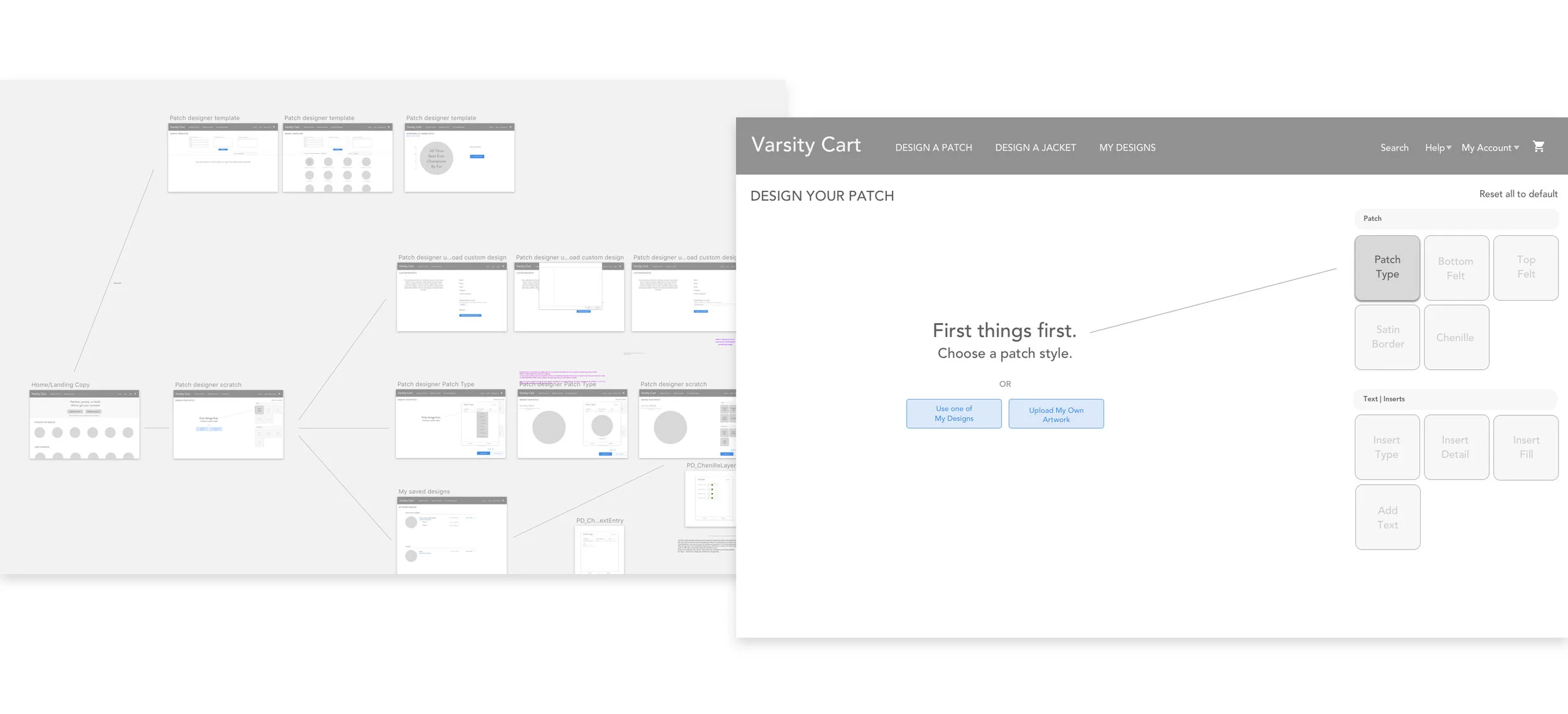
Scalable UI Patterns That Make Creativity Easy
Building clear, friction-free paths to creativity
Options that are easy to access
Since both jackets and patches have various customizable elements, we needed a simple modular system usable by both entities that would allow users to enter into the various "variables" that each product provided. This way, there was no locked-in linear motion -- the user could add and take away in any order, to their heart's content.

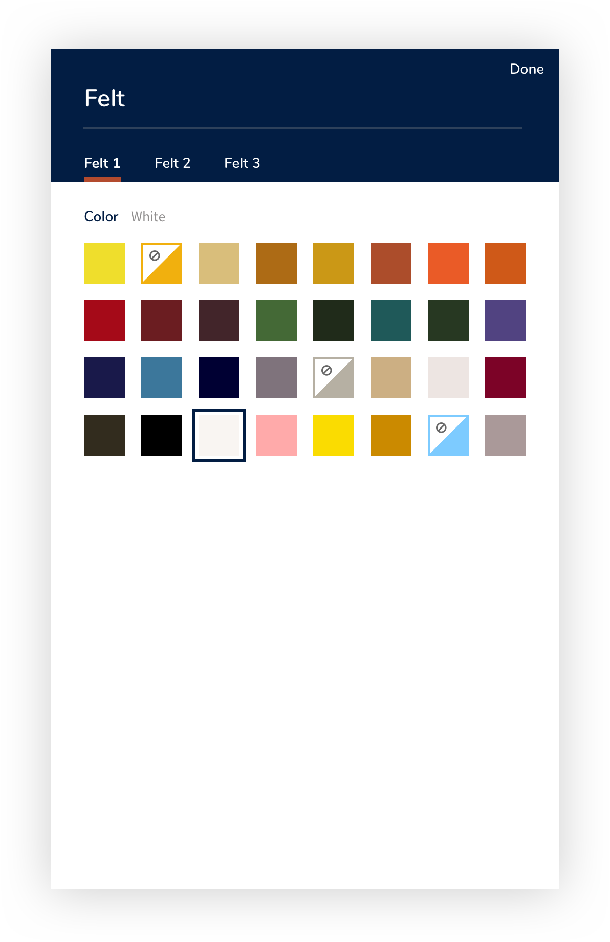
Clarity & consistency
Seemingly small touches make a difference in assuaging confusion & frustration -- for example, how to show that a color is unavailable. I needed to keep the visual rhythm in place and to maximize clarity for the user. Using a color would have confused it with an available color; using an X felt like it was never available. A flag with a "prohibited" icon kept the aesthetic in place and made it clear it was not available.

Making the complicated simple
It should be easy to know how to add and take things away. Period.
By employing a tabbed structure with numerical indicators, we were able to provide both tasks within one modal in a clear and easy way: customize and add one instance of something or ten instances of different things. This meant that opening and closing the modal maintained the same status for the user and precluded confusion as far as which instance / how many instances / how do I edit this instance / etc. The "On Patch" tab thus provided a place to remove or go back into that instance to edit.


Modularity & No Dead Ends
Start with either, combine them later (or not)
Whether starting with a jacket or a patch, we needed a seamless, easy way to either purchase them individually or add it to the other. Or add it to one in the cart. Or add a new patch to a jacket in the cart. Get the idea?
We needed easy escape valves and connections going between them at every stage -- without overwhelming the user. Careful UX thought & UI design yielded simple, clear action options and clarifying modals where appropriate.


When adding a patch to a jacket, we designed a way to easily pull from any of three places: your saved designs, your cart, or create a new one.
