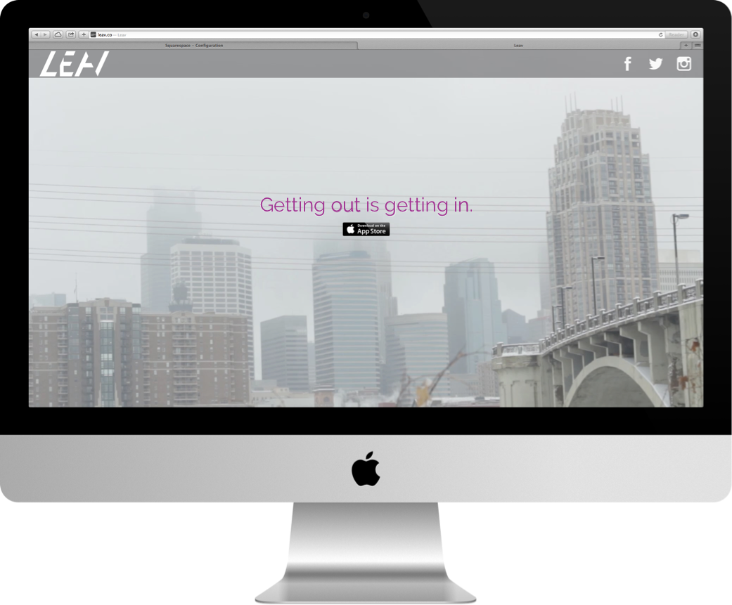
The Leav identity:
Hidden right under your nose
My approach to the brand feel was inspired by the idea of the app itself: a juxtaposition of soft, abstract entities (the emotive, human-made artwork) and the more rational realm of digital apps. Hence, we wanted to bring a sense of melding of the realms.
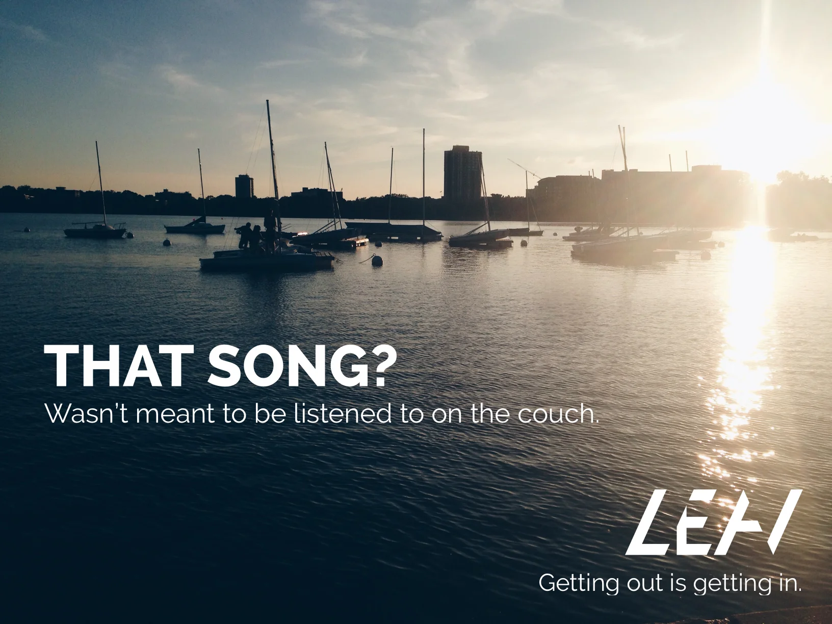
But perhaps most importantly, we wanted a subtle sense of obscurity and obfuscation -- the artwork, after all, was going to be "hidden" right in front of you, accessible only if you had the app. The subtle hidden forms of the lettermark (the left half of the V, the top left of the E, right edge of the A) did just that -- communicated that there were entities right in front of you that might be invisible, but are certainly "there."

Intrigue & gradient
Our choice in color and gradient, then, was intended to bring a softness & a bit of intrigue to a more rigid, straight feel of the letterforms themselves. The gradient was also influenced in part by the recent onset of then-new iOS 7, gradients, and while the design feels outmoded at this point, it was following the "flat is king" mentality of the era (2013-2014ish).

Letting the artwork speak first
Our intention was to make the app as simple as possible so that the artwork itself would be easily accessed. Since the entire point behind the MVP of this app is to allow curated artists to "install" their work throughout the world, we wanted the map to be the place that the users land once they're into the app.

Making the interactive part easy to understand
In addition, we wanted a simple set of UI elements to make it clear where artwork is and whether or not you've accessed it. We also developed a way to indicate what requirements were needed to access the artwork -- either it needs to be a certain time, temperature, etc., and what environmental elements influenced & interacted with the piece once you are in it.


Original screens