
A Blast From The Archives…But Why?
This is one of two projects I’ve included from nearly 10 years ago that, though old and outdated, gives a strong sense of my penchant for new ideas and how I approached solving ideas & problems a long time ago. Much of the thinking “chops” were there – things like an inquisitive spirit, iterative appetites, and cross-disciplinary thinking.
I’ve included it here as a way to see that my work has been relying on robust process and intellect for years.
Hope you enjoy.

From The Archives: Leav App
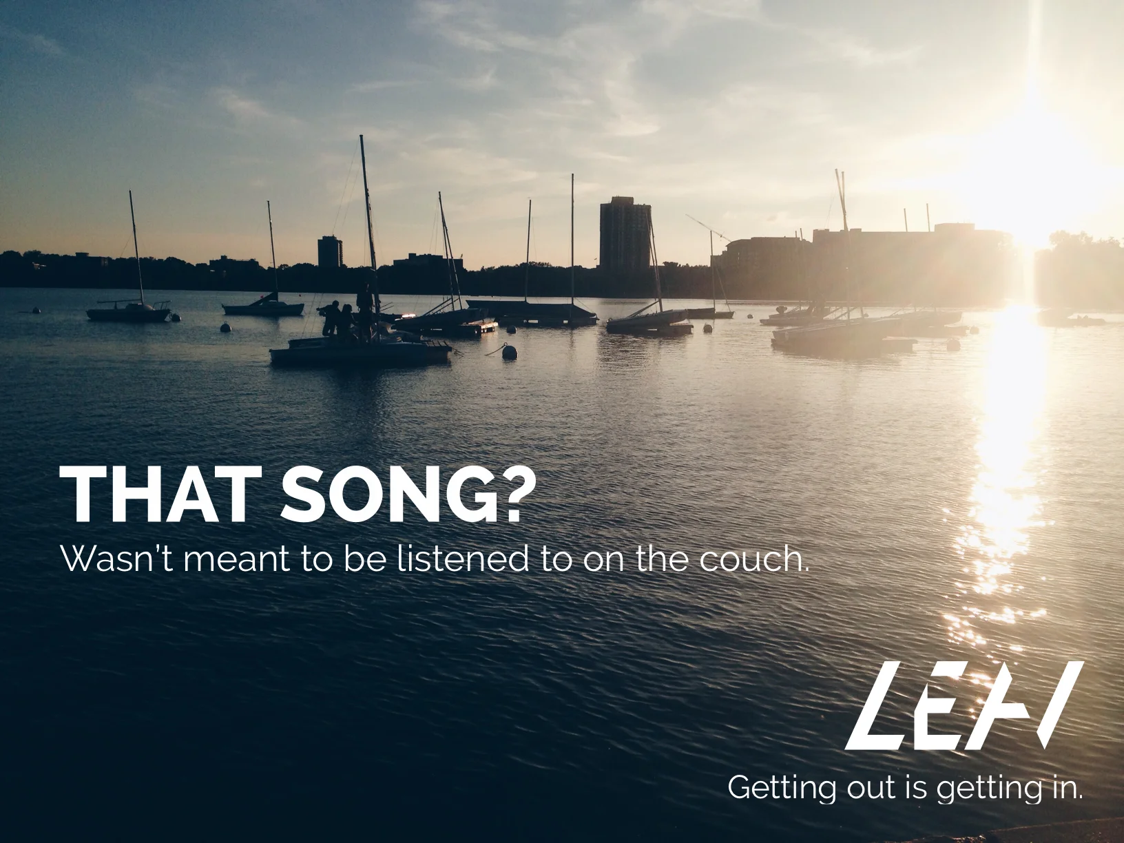
Reconnecting Art & Surroundings In The Digital Age
Logo & Identity Design
Art Direction
UX Design
UI Design
Co-Founder
Be exactly where the artists intended you to be when you experience their work.
Leav was conceptualized to rekindle the idea that art can interact with its surroundings in dynamic, powerful ways. Thus, Leav allowed artists to "install" artwork throughout the city, accessible only through the app and only in that particular location (and/or at a particular time, temperature, and more). In addition to it being available only in a specified location, by utilizing such factors as temperature, weather, and/or movement, users access and interact with the art in a nuanced and dynamic way - right where it was intended.
What does this mean? One example is it allowed artists to make music available only at certain lakefront beach at a certain time at a certain temperature range. Or, they could install a spoken word piece or poem right on the corner of a busy intersection. In this way, the surroundings mattered again, and we gave artists a way to "install" their artwork digitally.
Though surroundings are all but lost in the shuffle of the "I can get anything anywhere, anytime" of our modern lives, there is something beautiful about knowing you're exactly where the creator intended you to be when experiencing their work.
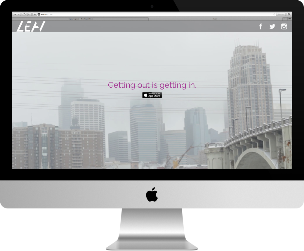
Leav is no longer available, but we had a blast while it was.
Press & Accolades
CITY PAGES APP OF THE YEAR, 2015
WINNER, McKNIGHT GRANT FOR NEW MEDIA INITIATIVES
PARTNER, EAUX CLAIRES FESTIVAL, SUMMER 2015
FEATURED APP, MN ORIGINALS/TPT
FEATURED PRESENTER, WALKER ART CENTER / ALEX OHANIAN, JANUARY 2014

The App Itself
Identity, UI, Promo
The Leav identity:
Hidden right under your nose
My approach to the brand feel was inspired by the idea of the app itself: a juxtaposition of soft, abstract entities (the emotive, human-made artwork) and the more rational realm of digital apps. Hence, we wanted to bring a sense of melding of the realms.
But perhaps most importantly, we wanted a subtle sense of obscurity and obfuscation -- the artwork, after all, was going to be "hidden" right in front of you, accessible only if you had the app. The subtle hidden forms of the lettermark (the left half of the V, the top left of the E, right edge of the A) did just that -- communicated that there were entities right in front of you that might be invisible, but are certainly "there."

Intrigue & gradient
Our choice in color and gradient, then, was intended to bring a softness & a bit of intrigue to a more rigid, straight feel of the letterforms themselves. The gradient was also influenced in part by the recent onset of then-new iOS 7, gradients, and while the design feels outmoded at this point, it was following the "flat is king" mentality of the era (2013-2014ish).

Letting the artwork speak first
Our intention was to make the app as simple as possible so that the artwork itself would be easily accessed. Since the entire point behind the MVP of this app is to allow curated artists to "install" their work throughout the world, we wanted the map to be the place that the users land once they're into the app.

Making the interactive part easy to understand
In addition, we wanted a simple set of UI elements to make it clear where artwork is and whether or not you've accessed it. We also developed a way to indicate what requirements were needed to access the artwork -- either it needs to be a certain time, temperature, etc., and what environmental elements influenced & interacted with the piece once you are in it.


Original screens